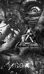
It's kinda hard to read the text, maybe you should add a stroke around it.
Looks a lot better with the outline. Nice job.
I like it.
2nd one looks pretty slick.
I was hoping for some animation
Maybe alittle zoom in out
anyways its cool, I like it
Looks pretty dope, a black outline around the text would make it easier to read and if the background was moving it would look awesome.
Pretty cool man
Looks amazing! i like the background alot.
Pretty cool looking honestly
You should place pixels on your own, instead of reducing the quality of existing renders, or at least you should adjust them.
This is very apparent with the tunnel-like render as after a certain point the lines merge together.
At least, that's my 2cents.
Man, i'd love to do that kind of piwel art myself, the 2 are really great, continue like that & five us more
Originally Posted by Ogma.
Man, i'd love to do that kind of piwel art myself, the 2 are really great, continue like that & five us more
Grab any image of your choice and apply a pixel blur to it, done.
You can even practice it yourself with the same resources used by the OP as he was kind enough to link them!
Seriously, pixel art is amazing when it's the artist placing the pixels, it takes a ton of patience to do that, plus it's not easy to get the most out of every pixel.
However, it's very easy and unimpressive when you let a machine blur it out for you and call it pixel art.
So yeah, don't be fooled.
That looks really good. Especially for 15 minutes!