ArtPixel art

Posts 16–21 of 21 · Page 2 of 2
Quote Originally Posted by ButterButt View Post
You should place pixels on your own, instead of reducing the quality of existing renders, or at least you should adjust them.
This is very apparent with the tunnel-like render as after a certain point the lines merge together.
At least, that's my 2cents.
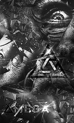
The canvas size was 191 x 108, so I had to zoom it in before adding the text, and took this picture as a screenshot, coincidentally it took off the quality of the background, fitting it more, so yeah, and one of my friends had suggested me to place my own pixel so I might try it next.

- - - Updated - - -

Quote Originally Posted by Ogma. View Post
Man, i'd love to do that kind of piwel art myself, the 2 are really great, continue like that & five us more
I can help you with it, it's not as hard PM me.
Bad choice for stroke color, I believe a darker color would suit better.
5/10 overall
Quote Originally Posted by Mokou-Sama View Post
Bad choice for stroke color, I believe a darker color would suit better.
5/10 overall

It wasn't stroke though lol,
I was going to choose a different colour but white stood out for me.
Quote Originally Posted by NUKE99X View Post
It wasn't stroke though lol,
I was going to choose a different colour but white stood out for me.
Sure,but you got the point.
We all got different styles so it's okay
same as matrix,but it really cool guy
Posts 16–21 of 21 · Page 2 of 2

Post a Reply

Similar Threads

Tags for this Thread

None

Talk with us