My first photoshop
I just fooled around and read some tutorials online just to get the basics down. I am aware that it is really sloppy but it is my first photoshop creation ever so please leave constructive criticism on what I need to work on, what I could add to make the sig better, and how I could improve me skills and make better, cleaner, cooler sigs and avatars.
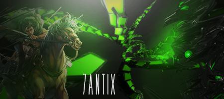
Here is my second sig, what do you guys think? Better, worse, or same as first one? The second one isn't completed yet I still need to add some things but uploaded to see what you guys think and what I should fix or how it could be improved upon.
A)

B)

Third sig which one you guys like better?
A)

B)

Here is my second sig, what do you guys think? Better, worse, or same as first one? The second one isn't completed yet I still need to add some things but uploaded to see what you guys think and what I should fix or how it could be improved upon.
A)
B)
Third sig which one you guys like better?
A)
B)


 Originally Posted by murdknife

 But I got a basic understanding of how stuff works so i will put more effort time and originality into my next one.


