I have returned
I have returned
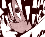
I HAVE COME BACK TO MAKE MEDIOCRE SIGNATURES AGAIN... I thought I'd start with a simple signature as my return.

CNC.
CNC.
Text is too demanding and the lighting just feels washed out and bad. Not really much going on so I guess all I'd say is add more effects? It is simple but not effectively simple, meaning it isn't appealing enough to stay the way it is 
Anyways who are you?
Anyways who are you?


 and what's up with a random splash of turquoise?
  oh, too much smudging also, but keep it up (:
 its awsome!!!
  Keep the goodwork Up!
